
A team of 50+ SCAD students worked with the City of Atlanta to improve the accessibility of affordable, healthy food options for local neighborhoods, residents, and visitors. It was a comprehensive collaboration that includes exploring the development and design of a retail establishment to service the community. Our brand, Azalea's, was chosen by the clients because it fulfilled the need for an authentic, accessible grocery store that was clearly designed for and by the people of downtown. It successfully opened in September 2025 after securing $11.5 million in funding.
I served as the sole illustrator on this project. In addition to providing custom illustrated patterns, I also designed spot and full-size illustrations to elevate the project's branding concepts. I adapted my illustration style to fit the more graphic and bold creative culture that Atlanta is known for.
I am thrilled to share the wide range of assets that I created for this project. Please enjoy exploring the brand and learning more!
SCADPro Collaborative Design Studio X City of Atlanta
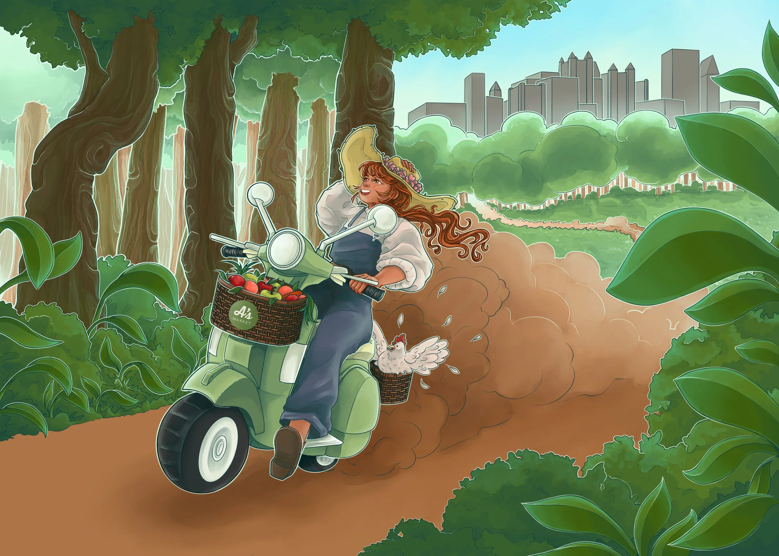

As the sole illustrator on a collaborative project, it was primarily up to me to determine which assets the branding concept needed and to fully develop them. One of my main initiatives was the idea of including a couple mural options in the brand package: combining the creative and lively culture of Atlanta street art with the welcoming and accessible nature of our brand. The produce stand was my original idea, meant to invoke the communal and locally-sourced feeling of a farmer's market. Later, as we continued to refine the branding concept, I developed the personification of the brand, which connects the local farmers and producers with the people living in the food deserts of Downtown Atlanta.
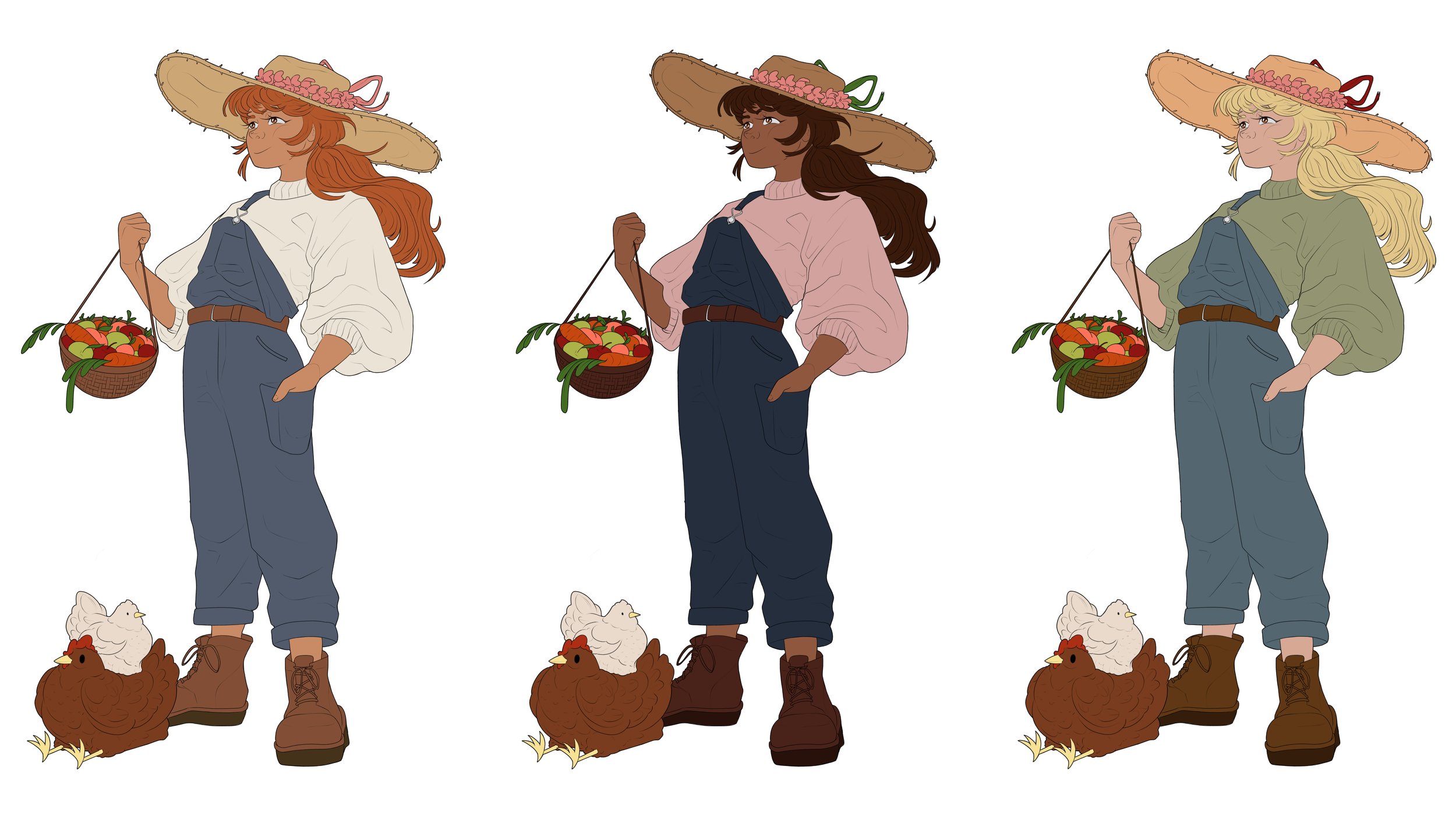
As I developed the character of the brand, a few questions were raised. What should she look like? What aspects of her appearance are important? How does she convey the brand values of freshness, accessibility, and quality? The entire team eventually decided on the first design, as she is easily recognizable, approachable, and generally ambiguous.
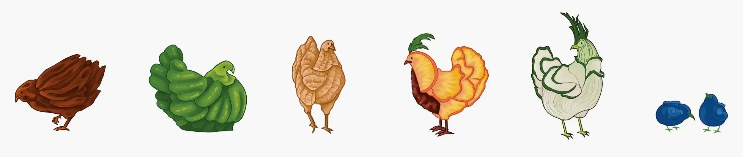
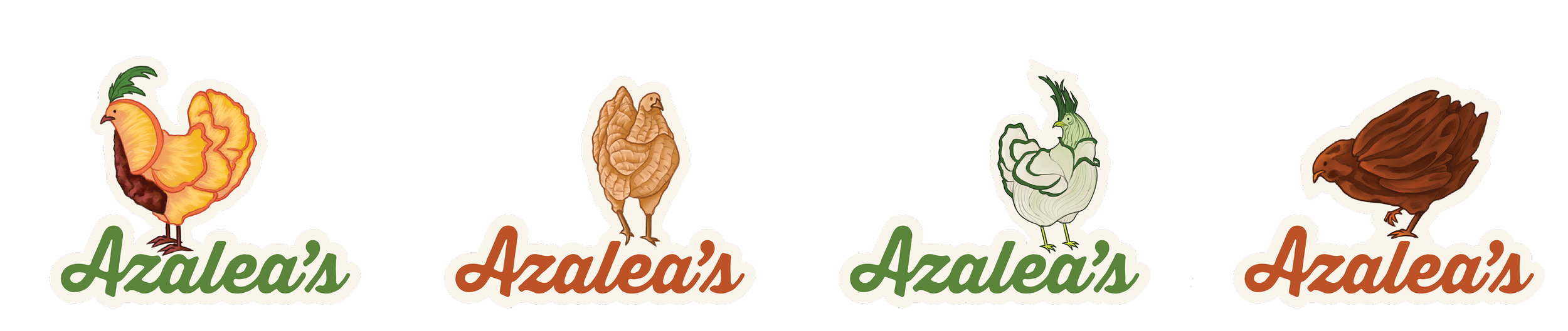
The most fun part: stickers! I created a variety of different cute creatures to use as potential marketing materials. Each one is correlated to the top produce items that Georgia generates and/or exports every year (also pictured in the patterns below!). Chickens were a cute and versatile way to create a humorous and enjoyable continuity throughout all of the visual material I illustrated. There are pecan chickens, bell pepper chickens, peanut chickens, peach chickens, spring onion chickens, and blueberry chickens to collect.
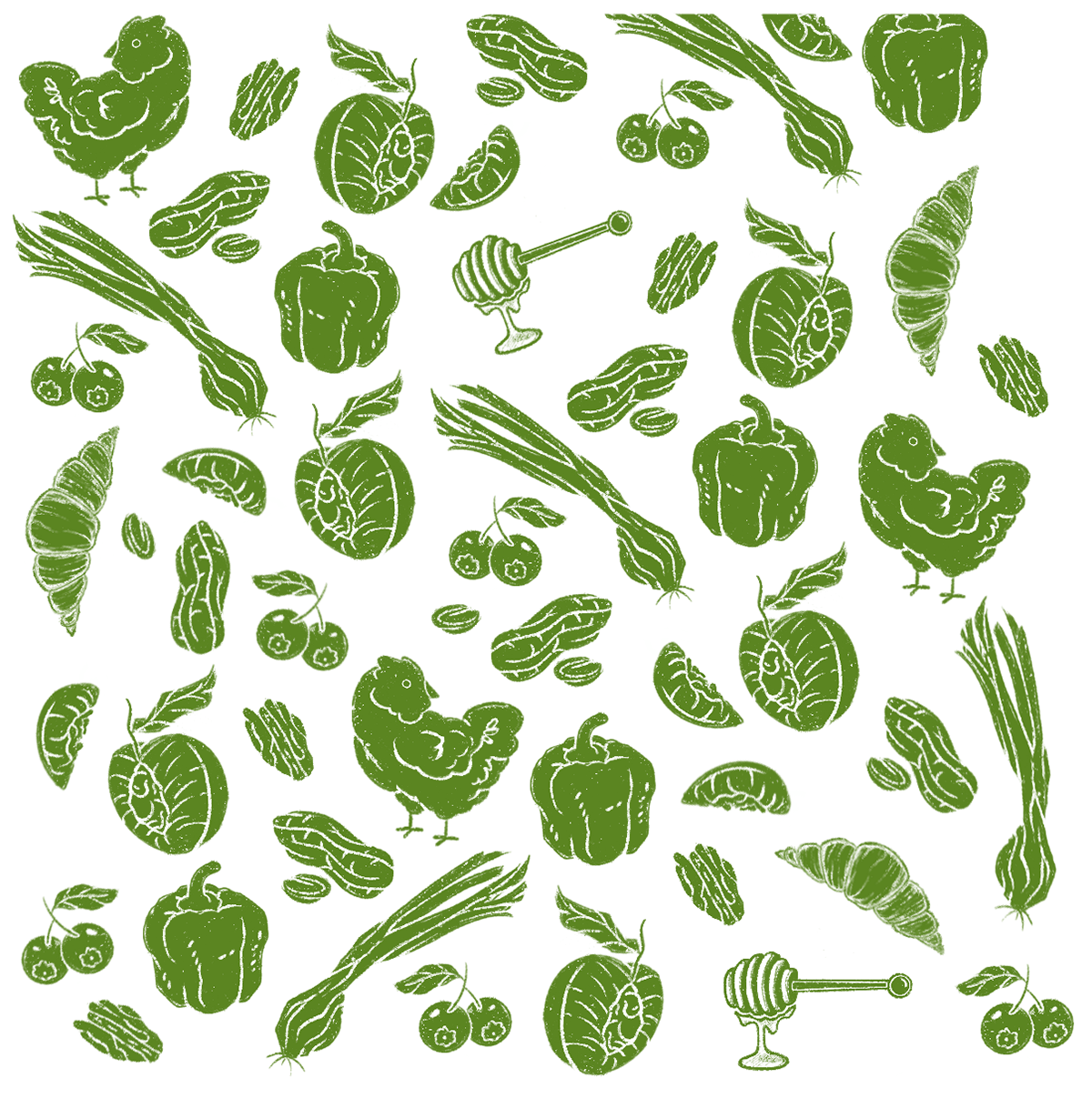
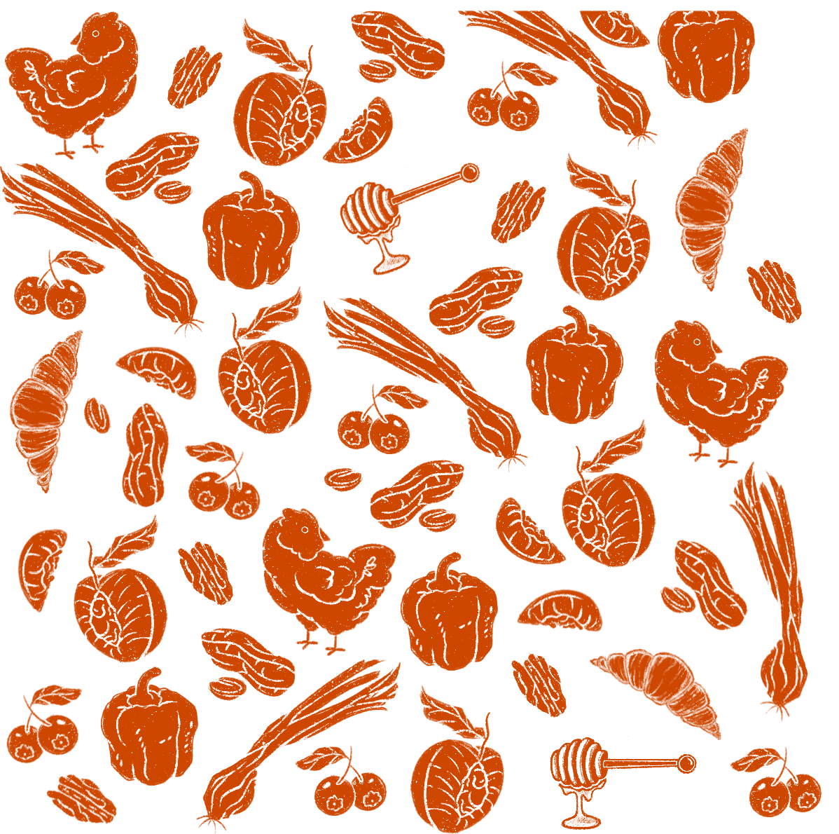
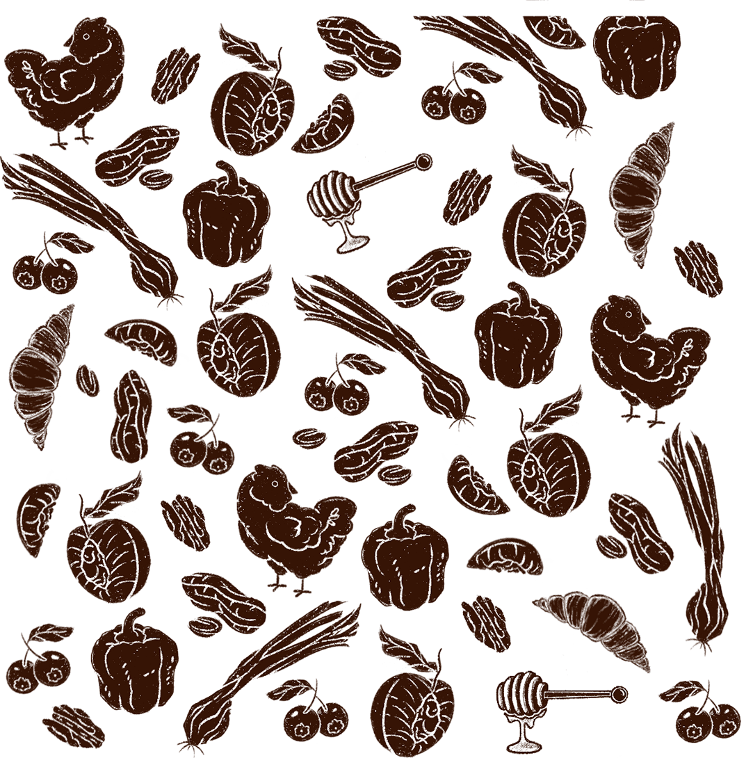
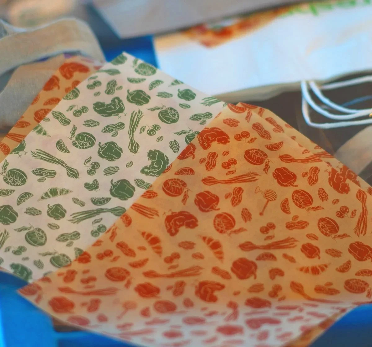
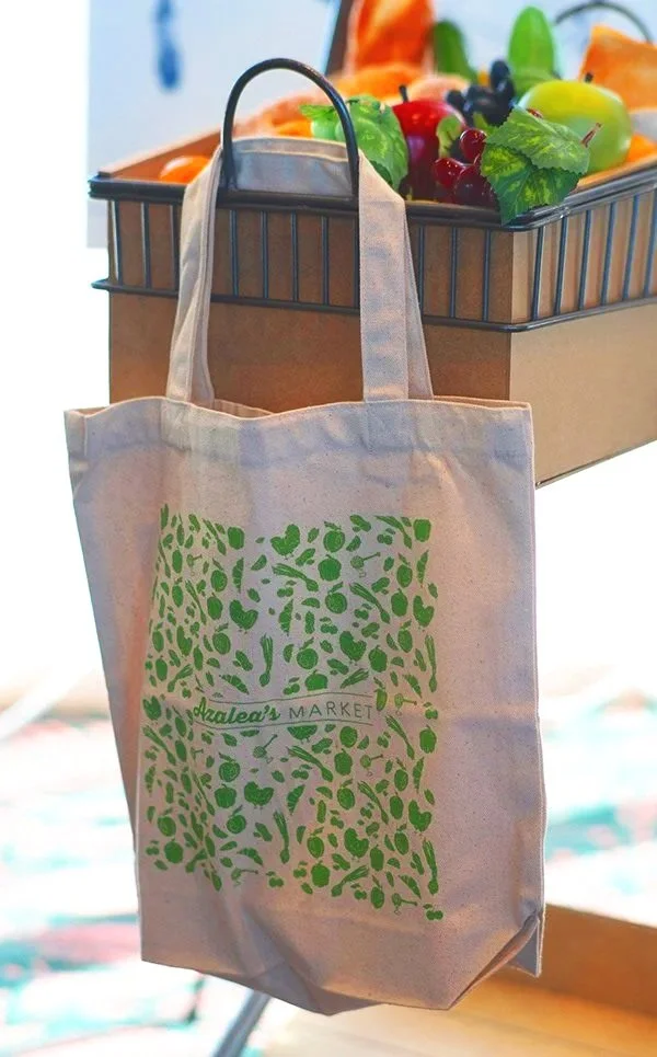
Finally, the idea that started it all: a simple pattern compromised of Georgia's top produce items to be used on a reusable paper or tote bag. The artisan and playful nature of the brand grew from this original initiative of mine. Getting to see my work printed on professional mock-ups for our final client presentation was an unbelievable opportunity that I will never forget.
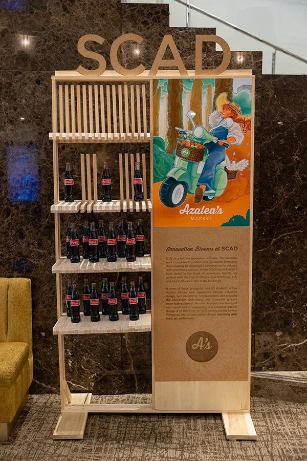
Mayor of Atlanta's 2025 State of the City Address; Azalea's display.